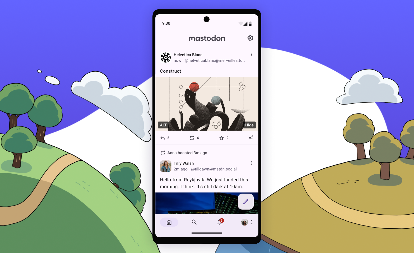
While usually our app updates don’t get a dedicated blog post, this one is a bit bigger and provides a good opportunity to reflect on how the Android app changed since launch roughly a year ago. Today, Mastodon for Android has received a complete Material You redesign. We left no stone unturned—tab bars, settings, composing—everything is refreshed and reflects your color palette.
We’ve entirely revamped the previously sparse settings section with dozens of new ways to customize your experience, as well as the ability to access information about the server you’re connected to and view its rules. You can choose to hide boost/favourite counters, remind yourself to add alternative text for media uploads, change your default posting language, hide all content warnings and much more.
When developing our native apps, we don’t just copy how everything works in the web app, but deliberately take the opportunity to have our professional designers work out the best user experience from first principles. As a result, profile screens now ergonomically display all the featured content that was previously missing from the app—like pinned posts, featured hashtags and endorsed users.
We’ve also finally added filters management into the app. You can now view, edit and create filters for specific phrases or keywords, and customize how and where exactly those filters apply, so if there’s some topic you never want to hear about, you can just tune it out. For more peace of mind, we’ve also added the ability to temporarily pause all notifications.
One subtle but important change is where and how we show verifications. If a profile has a verified link, we’ll surface it in search results and other lists so you can more easily tell different profiles apart. All in all, this is just scratching the surface of all the changes in this redesign. There are so many more features, bug fixes, and easter eggs we didn’t cover. Try it out!
Mastodon is a non-profit headquartered in Germany and fully crowd-funded through donations. If you enjoy using mastodon.social, or our official apps for iOS and Android, or want to support the development of the server software itself, you can donate to our non-profit on Patreon.
FWIIW Kbin can access Mastodon content, but am I right that it’s not true the other way around? (And Mastodon does not federate with Lemmy or Kbin?). I never got into Twitter, maybe I should give Mastodon a try though although I still have no idea what I’d use it for. Curious what folks here follow on Mastodon that they couldn’t find elsewhere?
I’ve been meaning to try out Mastodon for a few years now, but have never been able to muster the patience to learn something new. Maybe now would be the right time considering Reddit and Twitter are as good as dead lol.
Was always a fan of the official app but it looks fantastic now. Very fluid UI and the Material You theming is great.
That’s so nice. Husky for Android (pleroma/akkoma/soapbox) app works nicely, but is broken in some places and aesthetically outdated.
I’m not familiar with Husky but looked it up just now. Does it offer much over Tusky it was forked from?
For mastodon no. Husky was specifically made to be compatible with certain pleroma features (emoji reactions, unlimied attachments, stickers, etc.).
it’s mostly focused on adding pleroma/akkoma support. It can show and add custom reactions (only when someone else has already added one on a post), and some other stuff. But it’s not a good app. Images take ages to load!
The new design is indeed amazing.
But is it just me, or did they indeed removed lists, can’t find a way to add to a list or follow a hashtag, neither see or edit my lists in the new version.
I started using the official app after the update. It’s great but doesn’t even come close to Fedilab or Trunks.
I was on the official app a while back then ended up on Tusky. How does Tusky compare to those options?
Tusky is great but doesn’t have material you support.


