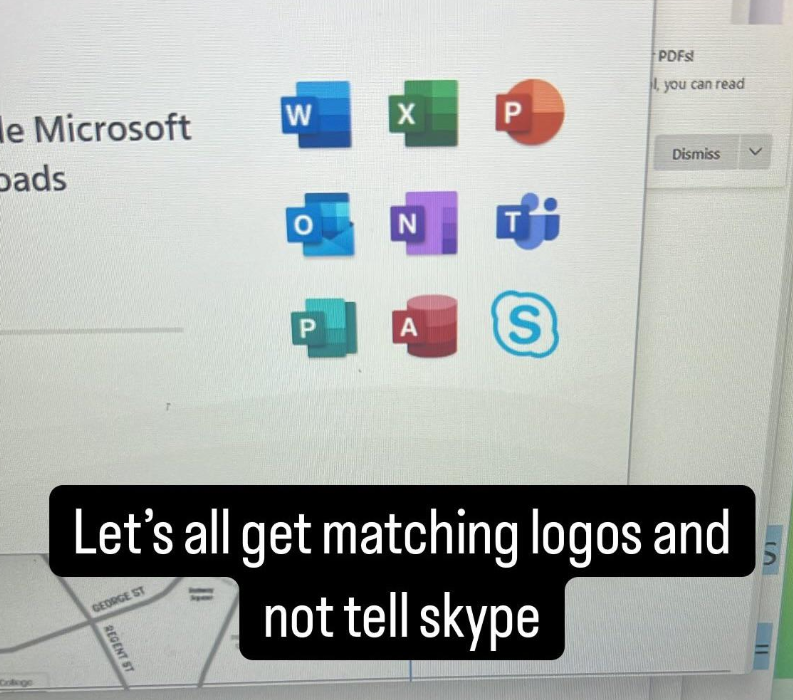
I am not goalpost moving. Just pointing out that your argument of the icons being clear is valid for the older icons. The new ones are just coloured blobs.
I actually didn’t realize until y’all’s thread here that the new icons actually do contain a stripped down version of those older, clearer indications. I’ve looked at them many, many times and just saw meaningless vague color gradients.
I said “visual representations of”. I never used the word “clear” (I did in my second comment, but only to paraphrase that you said “obvious”). And no, they’re not “blobs” (i.e. amorphous spherical things), they are primary shapes. Those shapes do represent the primary function/interface of each app in some way.


I am not goalpost moving. Just pointing out that your argument of the icons being clear is valid for the older icons. The new ones are just coloured blobs.
I actually didn’t realize until y’all’s thread here that the new icons actually do contain a stripped down version of those older, clearer indications. I’ve looked at them many, many times and just saw meaningless vague color gradients.
They are bad 🤷♂️
I said “visual representations of”. I never used the word “clear” (I did in my second comment, but only to paraphrase that you said “obvious”). And no, they’re not “blobs” (i.e. amorphous spherical things), they are primary shapes. Those shapes do represent the primary function/interface of each app in some way.
I call them blobs mainly because they are not distinct enough.