
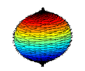
The theorem has been expressed colloquially as “you can’t comb a hairy ball flat without creating a cowlick” or “you can’t comb the hair on a coconut”.
The theorem has been expressed colloquially as “you can’t comb a hairy ball flat without creating a cowlick” or “you can’t comb the hair on a coconut”.
That may be the case, but i have seen websites use js for it. Another thing is, what version of css does wikipedia target, as ye older verisons might not have that.
Sure, some websites do that, but it’s simply wrong to say “having adaptive view usually requires js”. No, it doesn’t, usually responsive design doesn’t need JS.
If a browser doesn’t support media queries, it would just show the desktop version. Media queries have been broadly supported since 2015. It’s possible that Wikipedia still targets older browsers, but IMO it would be fine to show the desktop version on mobile browsers older than that.
Even in my original comment i said there are non js ways. But what i primarly meant here is, there are differnt “ideas” of implementing a mobile site, some just change element sizes, and make them vertical viewing friendly, but others do change quite a lot, for example, remove most clickable items from the header-bar or title bar, and move them to a kebab/hamburger menu. And I know even this particular example can be done in pure css, but I still feel my statement is not simply wrong.
Also I am not a front end dev, so I am sorry if I get stuff wrong.
No, you’re right. The important part I wanted to highlight is that the usual way is CSS, not JS. There are a bunch of websites that use JS for this purpose, and probably also many CMSs etc., but doing it using CSS is far more common.