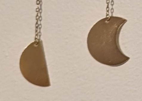
Looks innocuous enough at first glance right? Let’s zoom in on the problem:

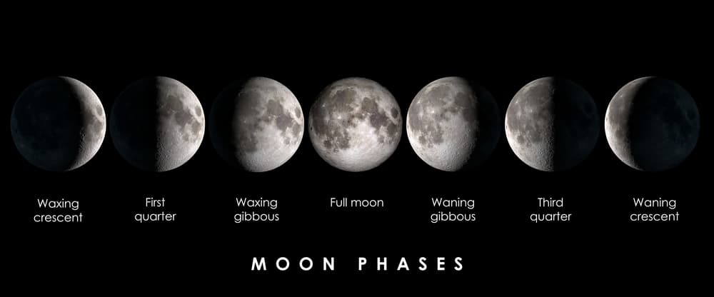
These don’t go together. If the semicircle on the left is correct, then this is showing moon phases, and the symbol on the right should be of a gibbous moon:

If the cookie-with-a-bite-taken-out in the right is correct, then this is showing an eclipse, and the symbol on the left should be of a 50% partial eclipse:

It drives me crazy every time I look at it.


I mean without the quarter moons it works for an eclipse… kinda… just gotta reverse the order on everything starting from the middle? and replace one of the hollows (eclipses/news) with another one of the fulls?
If you are concerned more with how the jewelry looks, I honestly like how it’s made better. more metal in the center. but I am with you on “it should be right I do not like that it is wrong” and I’d love if they had both options.