I mean, I don’t hate it.
I don’t hate how it looks, but I don’t like it, either. What makes me hate it is the complete lack of functional benefit and the honestly-kind-of-huge loss of functionality. Good luck on basically any website when ~20% of your screen is missing
That’s why I like screens that can handle arbitrary 22° rotations to maximize code space
What color are your programming socks?
Details are crucial for programming, not just socks, I think dressing up as different gender helps boost productivity
Phones right now have holes in the top part of their screen. You s have a decent rectangle in the center. The top and bottom can be used for buttons and video controls. Can be used to place gamepad for games. And so on. It would actually move a lot of the overlay off the video. And it would be a more organic shape in the pocket. Also corners are fragile break points when falling down. It would have many benefits.
If you can’t see the difference between a tiny front camera hole vs straight up removing the corners of the device, idk what to tell you.
Here is why I think it would work:

Also, Most video have a ratio that is wider than the phone in landscape.
I think you may be a bit behind on how large the notch is on new phones. It’s literally just the front camera hole on new phones, including Galaxy, Pixel, and iPhones. I’m fairly certain that’s also the case with the majority of other Android manufacturers such as OnePlus, but I can’t be bothered to check.
iPhone still have a notch
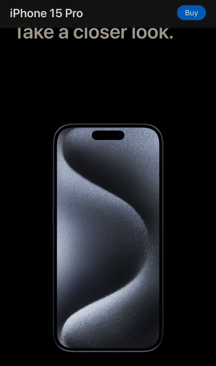
iPhone is pill shaped. Regardless as long as there is a space with the ratio of 16:9 in the center it doesn’t matter the shape of the edges. It would give you more real estate on the screen when doing other things than watching videos, plus the corners are not even touch friendly when held vertical.
The videos would be smaller, or the phone would have to be huge. I can already multitask on my phone, an oval shaped phone would be incredibly impractical. A notch/cutout isn’t a big deal, it just sits in the notification bar and phones didnt even used to have screen there anyway.
Phones getting too big is why they are harder to use one handed, not because they are rectangular.An oval shaped phone is simply far more impractical than a rectangular one. Sure, the far corners are a pain if you need to use it one handed, but that’s a significant amount of screen space you’re giving away for simply browsing things.
So sure, if you do literally nothing but consume video content on your phone, fine it could work. But who does that
this is the way, we have enough space for more distracting widgets
Or, clear the main display from all overlays depends on how you see it. I hate that overlays cover the video as soon as you do something.
Sounds like the perfect apple product
More like a Nokia product if they were still #1
I would guess it would keep any standard rectangular thing (videos, websites, apps etc) in the square part in the middle. The bottom could be reserved for app short cuts or home buttons, keyboard or something. Top could be for easy access notifications (you could read a full text and respond without closing the main thing you’re doing) or maybe a readout from an AI assistant.
Otherwise there are some benefits, it’s aesthetically pleasing, I bet it’s ergonomically nicer to hold, and the curved edges would make it structurally more sound, less prone to breaking.
I want a Dethphone:
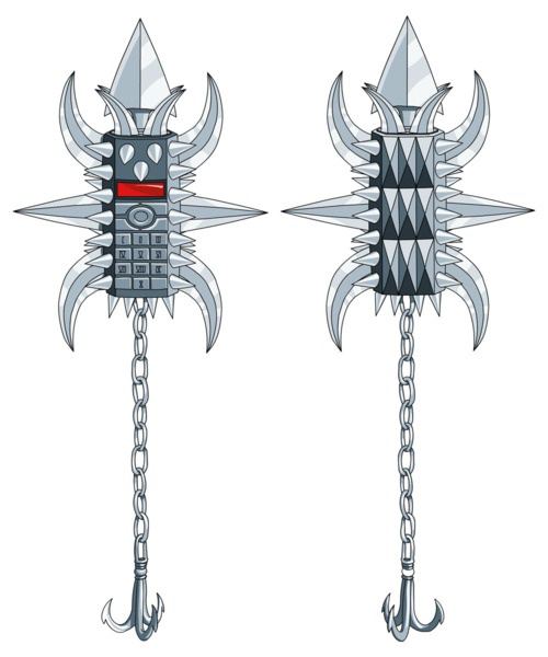
Awaken awaken awaken, take the calls that must be taken
You have 67 new telephone answering machine digital phone wireless fidelity Dethfone messages. To hear the messages, press “1” on the keypad located on the front of the phone. Preparing to play answering machine number message number one. After this message, would you like to save, or delete, or replay this message, please listen to the directions that will follow the message…
Nathan: Oh man, this thing’s just designed to eat up minutes. It’s brutal.
Still my ringtone to this day
Brutal.
I like the dimensions of the hand holding that phone.
Clearly it’s Jeff Goldblum’s hand.

Looks really easy to drop and break. Yeah Apple will probably do this then.
Apple suggests that instead of using a case and screen cover you should instead slather your oval phone with protective lube. Phone cases and screen covers might rub against the finish of your phone, completely ruining the phone, making it unusable. The protective lube won’t do that and will make your phone shiny when others look at it. And remember, if you haven’t dropped your phone in the last week, Apple experts suggest juggling your for a few minutes after applying a new layer of lube to scare off the invisible drop trolls that commonly plague Android users.
I was the proud, frustrated owner of one of these beauties
oh my God, it’s real!
Okay, that’s actually fucking cool
One of many true smartphones obliterated by the iPhone.
I can’t believe they even bothered making rectangular phones.
Tim Apple presenting it like it’s a portal [to a new era of mobile computing] is exactly what would happen lol
Then Samsung would make fun of it, then release oval phones 2 years later.
Make it egg shaped
Ring, ring.

Oh fuck, I want that. Gimme gimme.
That looks really nice as like a desktop device.
Oh hey, Wall-E scored.
Coo-coo-ca-choo
iCarly called… On this thing
Bottom right
“It’s the only phone that grows to twenty times its original size, and then transforms into a gateway to another dimension. You’re not going to find that if you stick with Android or Apple.”
Actually, I kind of dig it.
Until you need to adhere to standard formats for websites and what not.
Who needs standards anyway.
please God no
Image is not real. It lacks black bars on top and bottom of the screen.
What year is it? Now the black bars are at either side
Nope in todays world they have to blur the edges. That way one third on the right is blur and on third on the left is blur. Not sure who came up with that stupid idea.
Better idea the black bar is the whole screen
The camera is angled 22.5° as a compromise.
Many people here like it, and it honestly seems fine until you try to watch any full screen video.
This is a feature, not a bug. Oval phone shrinks your full screen size, and your normal videos and apps are surrounded by useful widgets. Adapted oval videos and apps will get real full screen.
It would be an actual argument to buy their proprietary, anti consumer hardware. Smartphones dont change much anymore. They’re pushing these finnicky folding displays at samsung but otherwise its the same brick, just more power, more energy consumption and more bigger cameras. There is barely any innovation compared to the first couple of years. Not to speak of the unrepairable, buy for the landfill airpods.
Oval phone, a revolutionary shape change, it is more in line with the natural range of your eyes.
And a pain in the ass to hold comfortably. Especially if you have any muscular issues (like me)
It’s better than The Notch.™

