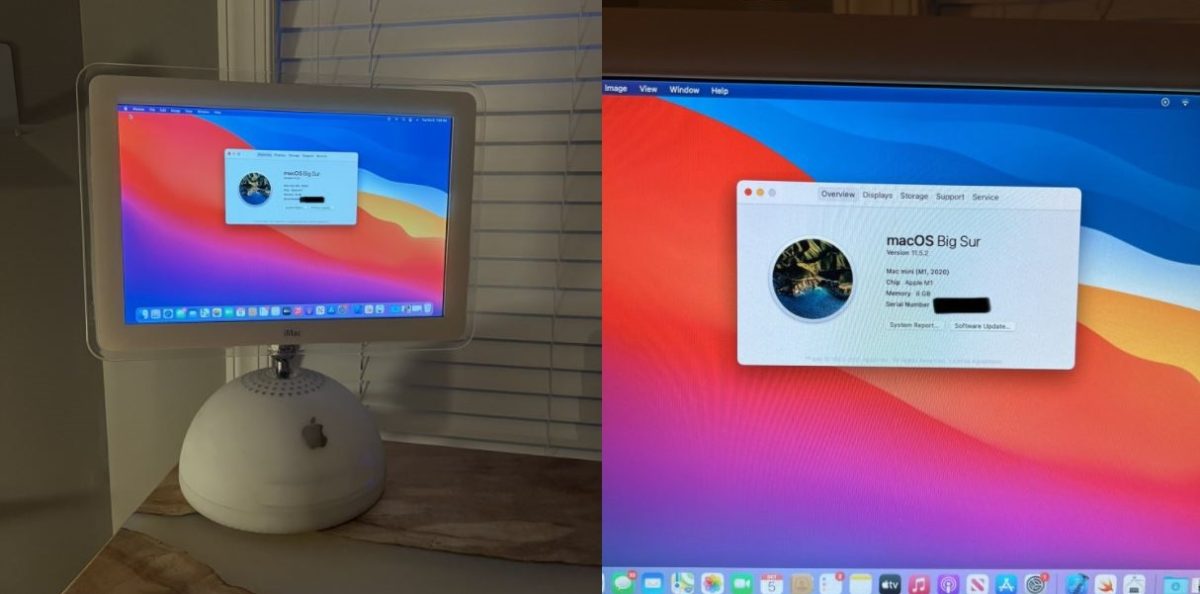
I found that design hideous at the time and I guess things haven’t changed in that regard
I disagree, that round plastic glossy thing could look nice. A bit like SW-themed website design in Star Wars: AotC times.
But that’s if the actual GUIs would not cause nausea.
And if they wouldn’t try to make it look expensive.
Actually what I liked in Apple designs in my childhood - they looked modern, friendly and kinda not too pretentious, in other words, cheap.
The majority of their customers apparently have the opposite criteria.
Hey to each their own! Apple’s hardware design in that era always makes me think of crappy protective cases. I really didn’t like how the opaque parts were behind thick clear shells. Or like…have you ever seen wooden furniture in a public place that has like 5mm of protective clear coat on it to the point that it looks plastic?
Sorry for the essay, I had not thought about what I specifically disliked until now lol
That’s an iMac G4 lol


